Better Bean
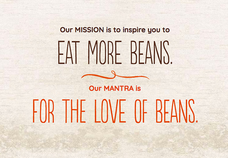
Fresh food gets a fresh design.
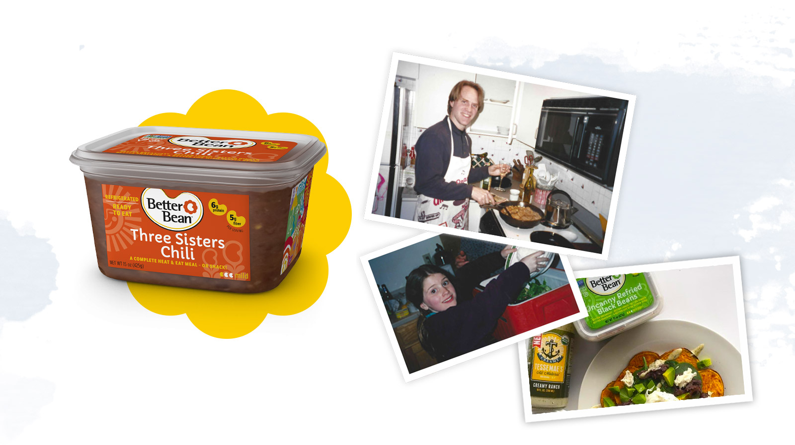
Born and raised in Portland, Oregon, Better Bean was founded by a dad who had a simple belief: fresh beans are better. After many weekends spent cooking his own recipe of refried beans for his daughters, Hannah and Brooke, he thought, Why not take his beans to the rest of the world? Growing from local stores and farmer’s markets, Better Bean is now available nationwide. So, when they approached us to solve some of their packaging, logo, and message woes, we couldn’t wait to help this family business realize its vision of bringing easy, tasty, healthy beans to everyone.
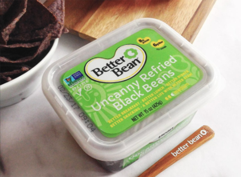
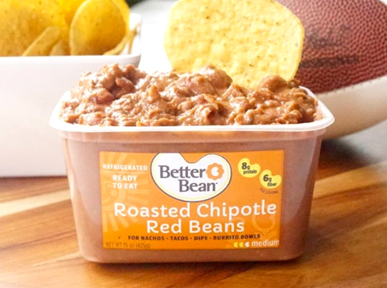
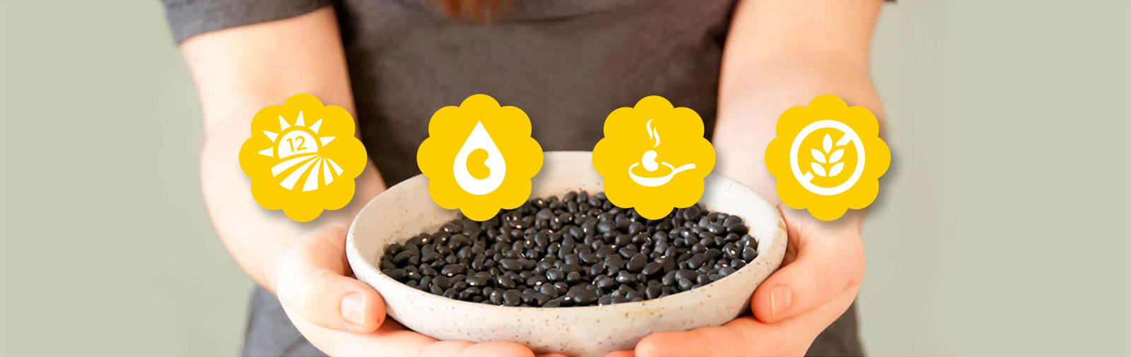
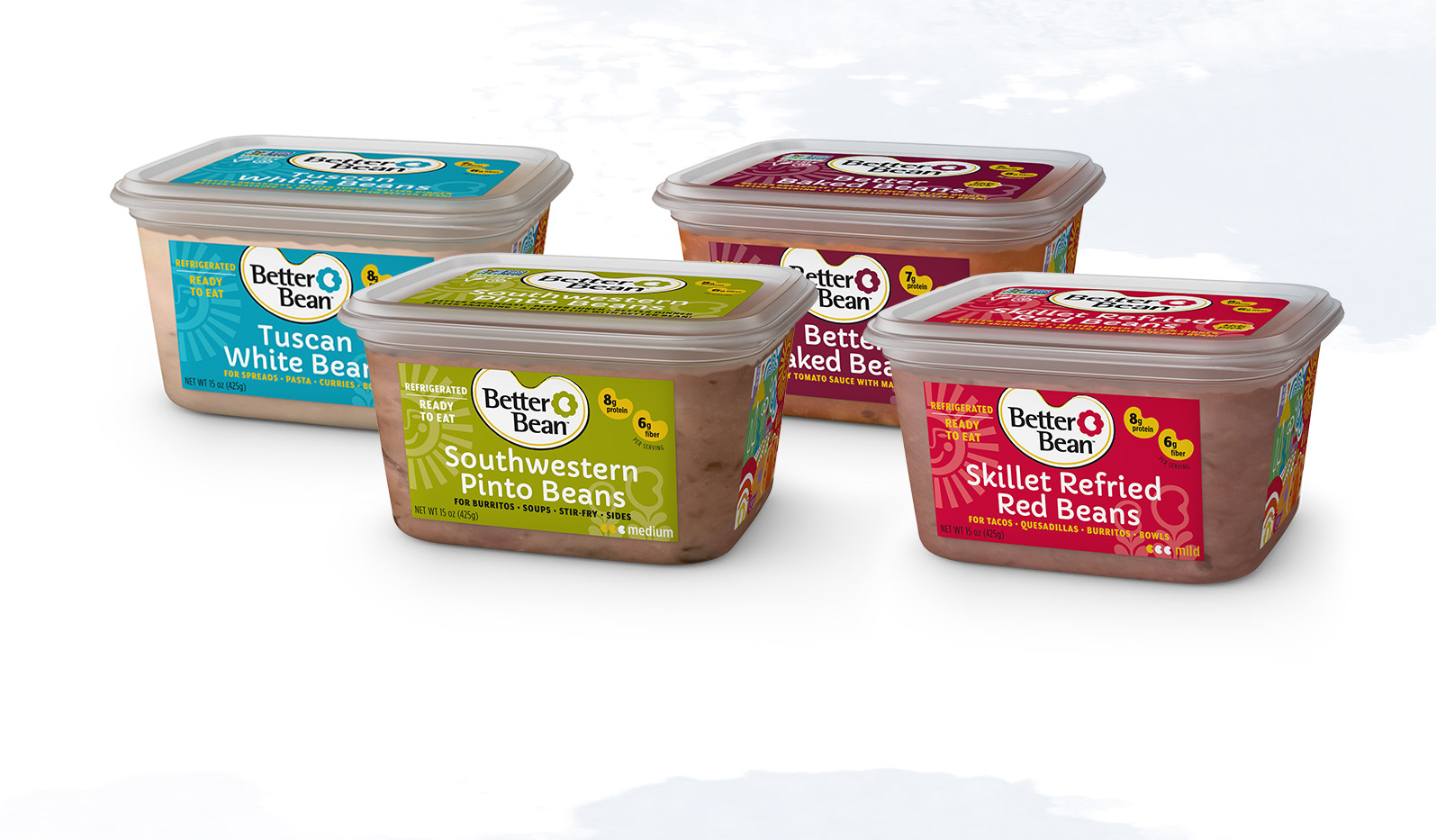
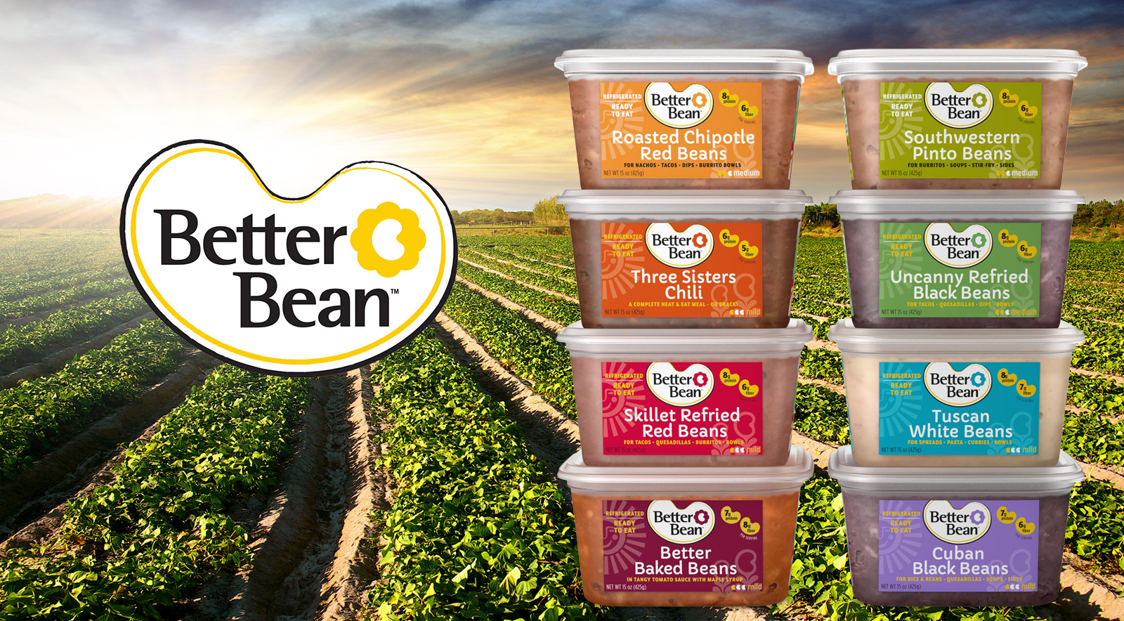
Better Bean needed packaging that was immediately recognizable, made it clear what the product was best for, conveyed a hip, non-corporate feel, and expressed its artisanal, healthy mission. Madplum reimagined the Better Bean logo with a fun, modern bean shape and created a new typography and color scheme to help each recipe stand out from one another but also family together for a distinctive, uniquely Better Bean style. Subtle, tonal illustrations reinforce a sense of natural, fresh food. We’re so proud to have been able to help Better Bean thoughtfully wrap their gift to bean-eaters everywhere.
identity, logo, packaging